[mc4wp_form id=”2320″]
Create a balanced page layout like a Pro.
Create a balanced page layout like a Pro.
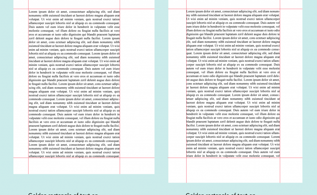
Intelligence can be seen. Yes, you heard it right. The design conveys intelligence. There are times when you feel overwhelmed with a task that has been assigned to you. You are unable to give your day a closure because you’re up all night thinking, “How can this design be exceptional”?
To create an exceptional design is an art. And my friend, you can be the artist. All you need is a little bit of a sense of aesthetics. In design, the major aesthetics lies in the page layout. Once you tackle this, half of your battle is won.
Many translation and desktop publishing services, content writing firms, graphic designers, art directors etc make wise use of page layout to bring out the promising design and accomplish communication objectives.
An advanced page layout design deals with the arrangement of,
- Texts
- Images
- Size of medium
- Colour of medium
What are the types of page layout?
It takes a great sense of precision to master the art of layout design. Page layout is an art of manipulating. Don’t take me wrong. Desktop Publishing aims at manipulating a reader’s attention on a page for successfully conveying the meaning and CTA’s.
Nobody wants to read an article with just chunks of texts. Absence of visual hierarchy is such a downer. Content with no graphic emphasis will fail miserably to convey the meaning.
Designers use page layout as an instrument to break the monotony and add visual flow and focal point to it so that the message is conveyed.
Page layout can be divided into,
GRAPHIC LAYOUT
- Mondrian layout
- Circus layout
- Multi-panel layout
- Silhouette layout
- Big-type layout
- Alphabet-inspired layout
- Copy heavy layout
- Frame layout
- Rebus layout
- Picture window layout
Web layout can be further classified as,
- Static
- Liquid
- Adaptive
- Responsive
- Hybrid
Graphic designers use a variety of layout depending upon the medium and content that they are working on.
The basics of the page layout.
The page layout has 5 major elements namely visual hierarchy, visual flow, grouping and element, how to blend these three and usage of dynamic display.
Design is a kind of service, so make sure you provide the best ones. Efforts should be made to improve visual hierarchy and thereby enhancing readability and user experience.
Ways to achieve a balanced page layout.
There are many designs but fewer promising designs. The difference between a design and a good design is the effective application of the design principles.
Whether you are working for print or online, it’s essential to use certain design principles to ensure design balance. A balanced page layout directly corresponds to the grasping of the message. It can be achieved by playing with the placement, formatting and rearrangement of elements.
An exceptional design is the one that not only conveys the message to the reader but also is pleasing to the eyes.
It’s important to have a balanced page layout. It gives meaning to your design. Following are the sure-shot ways to achieve it.
Grid.
Grids were earlier restricted only to print medium but with time this concept has also found its place in the digital medium.
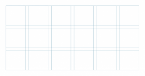
Grids are the backbone of the design. It is by far one of the simplest ways to achieve a degree of balance on your page. Click To Tweet
It not only provides a sense of order to your layout but also gives a feeling of cohesion and connectivity and the overall text seems more comfortable to the reader. It keeps the reader’s mind at ease and helps them focus on the message.

One can play with the various parts of the grids like formats, margins, flow lines, modules, spatial zones, column, rows, gutters, markers etc to obtain the desired results.
Focal point.
A focal point can be the best option to give a sense of balance to your layout. It is a point for your eyes to rest in a visual design.
Create a focal point by giving more visual weight than anything else. This can be achieved by selecting a single large image as the biggest element in the design. This gives them an image of a strong visual.
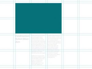
Contrast is also another great way to establish a strong focal point.
A strong visual acts as a guide for your reader into your page. A single element provides the structural element wherein you can arrange the remaining elements in your layout.
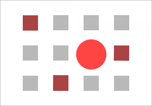
It’s not necessary to always use a single main element. In case you decide to use many elements on the page, make sure to group them together and align them in the same way. This helps to achieve a sense of balance.
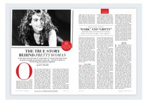
This method can be used for headlines or quotes too. A well-balanced headline gives a strong visual while providing the necessary structure that will help you to ensure the right balance.
White space
Stuffing your mouth with a big pizza slice is so peevish. One cannot enjoy the taste and also fail to appreciate the beauty that goes in the preparation of the food. The same goes for the design as well.
A newbie designer would be tempted with the idea of making use of every inch of space he has while designing. Happens right?
The true beauty of a design does not lie in shoehorning the elements but in leaving them out.
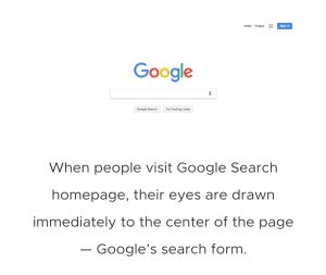
White space is any space that is empty in an image. If we talk about print media, white space can be achieved through enlarging page margins and gutters.
In the case of the web, providing ample room to breathe around elements makes your design more balanced.
Don’t introduce white space haphazardly, it might cause a sense of disconnection between page elements.
Hierarchy
Who does not love a little bit of sense of structure?
The sense of structure is really important in maintaining a balance in the page layout.
Deciding the relative importance of the different elements of the content on your page is the key.

We all know the most important part of the content is the headline. It has to be more visually important than the rest of the element on the page.
Scan through all the elements of your page layout and decide which is the most important one. Use the most important element to provide a structural hook for the remaining elements on the page.
The simplest of the design can be extraordinary if made significant.
Design can be complex but it’s up to a designer to make it simple. Everybody loves balance in life. The design also needs a balance. A well balanced and composed image is a sign of the best graphics. Next time when you sit to make a flyer or brochure, keep these things in mind because a better design means a better business.
Author’s bio:
Ahsanat Chaudhary is the Founder of InkTrust, content writing services. She is an avid reader and a steady learner. Along with exploring entrepreneurship, she also loves to sing.

I am definitely going to use these tips and tricks.
Thank you guys.
You always save so much of drama in my life.
It’s such an informative post.
Page layout really makes the difference.
Thank you for such a wonderful piece.
All the best for your future ventures.
I never gave much importance to page layout ever.
This is such an eye-opener.
Glad I stumbled upon this blog.
Will check out for more blogs.
Will share this with my team.
This immense value bomb will help my staff to up their game.
Great blog.
Desktop publishing is really an art and you guys are the best artist.
This is good stuff, its awesome to be in the know.
http://www.xmc.pl
Its such as you read my thoughts! You appear to know so much approximately this, such as you wrote the e book in it or something. I feel that you just could do with a few percent to power the message home a little bit, but other than that, that is wonderful blog. A fantastic read. Ill certainly be back.
http://www.pianino.xmc.pl
I have sent this to several buddies and re-tweeted. Thanks again.
http://www.pianino.xmc.pl
Przyjaciol nie poznajmy w biedzie, tylko po tym jak znosza nasz wymarzony sukces. cyt. Paulo Coelho. Na zlecenie ITI ProSystems… czytal M. Skrobosz… 🙂
http://www.metale.xmc.pl
Hi, I just discovered your blog via Msn. Your own article is actually pertinent to my life at this moment, and I am really happy I ran across your blog post.
http://www.socjologia.xmc.pl
Hi Really good post note. God bless, cure,invention You writers… 😉 do You seen ? Webmaster Guide ?
http://www.japan.m106.com
Pieniadz jest bezwonny, ale sie ulatnia. Autosugestia jest jest jedna, na wszystko podatna…
http://www.norwegia.xmc.pl
My brother bookmarked this site for me and I have been going through it for the past couple hours. This is really going to aid me and my friends for our class project. By the way, I enjoy the way you write.
http://www.filozofia.xmc.pl
Hi! Aw, this was a really nice post. In idea I would like to put in writing like this additionally – taking time and actual effort to make a very good article but what can I say I procrastinate alot and by no means seem to get something done.
http://www.usa.xmc.pl